While I was at Aspen Heights, I developed and designed all core company collateral like brochures, business cards, print advertisements, flyers, direct mail, invitations, online marketing, store interior and exterior signage, property environmental signage, and motion graphics. But most importantly, I helped Aspen Heights take a newly designed logo and begin establishing a voice.
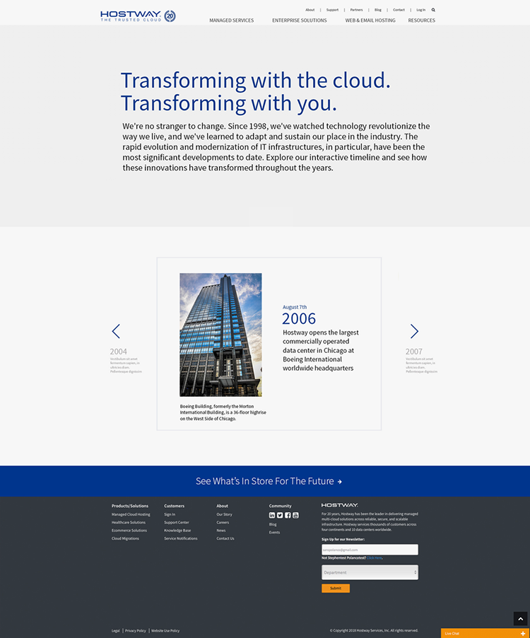
When I began auditing Hostway’s marketing collateral, I felt that all their touchpoints needed a pretty massive makeover. Red flags for me: overt use of stock imagery for social media tiles, clunky webfonts and iconography on the website, dated and uninviting case studies, and tradeshow promotional items that felt wildly off brand. As the sole designer, I had to be strategic about what to focus on, so that I could have an immediate impact on as many touchpoints as possible. I embraced process and celebrated progression.
I came to National Instruments as a contractor before taking a salaried position. Shortly after coming in and with very little exposure to the brand and company stakeholders, I developed new campaign style guides. On this page you’re seeing the first pitch decks I put together for company executives.
The approach you see in Treatment 2 was implemented globally in online banner ads, trade show marketing collateral, and print ads.
Treatment 1 eventually became the ethos for a full reboot of the company’s brand which you still see active today in their marketing. That ethos was all about a shift away from marketing solely focused on product highlights to imagery and messaging centered around customers.
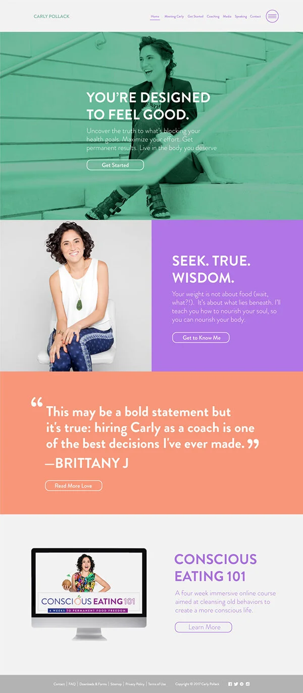
When I first spoke with Carly, founder of Nutritional Wisdom, she was interested in a "reskin." Carly wanted to use fewer images of herself, change her Whole Foods inspired typography, and to distill the website down to it's essential offerings. In the end, my "reskin" became a simpler user flow for the site, a new photo library, revamped webfonts, a rebooted logo, and the launch of a new sister-site, carlypollack.com.
HR software company, Sapling, came to me last spring asking for a sitewide refresh. They requested an audit to identify areas where they could help set themselves apart more from competitors and to feel the brand more throughout the site. To that end, I conducted a design audit that resulted in a new branded illustration style, new design components, and a new webfont.
Illustrations by Bri Juarez